Introduction to the Rule of Space
The Rule of Space in photography composition is a powerful technique that helps you place subjects to suggest movement, tell a story, or create tension. It draws the eye and gives the photo more dimension. Perfecting this method makes your photos more dynamic and alive.
I try to use space in photography composition to compliment my subject instead of allowing distracting elements to create tension.

The Importance of the Rule of Space
Enhancing the Narrative
Photos capture moments and tell stories. The Rule of Space in photography composition, enhances photos by placing subjects to work with positive and negative space surrounding them. This can suggest what might happen next or what the context of the scene is, adding a layer of storytelling to the image.
Creating Directional Movement
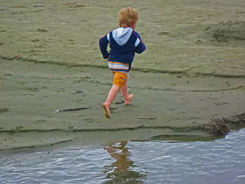
Directional movement is the path your eye follows in a photo. With active space, you can steer the direction of the viewer’s gaze and make your photo more dynamic. If the subject appears to be moving than I allow space in front of the subject to show the direction of movement.

Balancing the Elements
Using the rule of space well in photography balances all elements. This balance can be achieved by considering the weight of subjects and the negative space around them, creating a pleasing aesthetic that attracts the viewer.
By using less dead space and more active space or negative space, your element or elements will intrigue your viewer to observe your subject and its story.
How to Apply the Rule of Space in Different Types of Photography
Landscape Photography
In landscape photography, the Rule of Space can be applied by leaving enough space in the direction that the natural lines or features seem to be moving towards. This could be the empty sky in front of a mountain peak or open water leading towards a sunset.
Both active space and negative space when used properly help to define the emotion you felt to others. While dead space does the opposite and creates a distraction from the main subject.

Portrait Photography
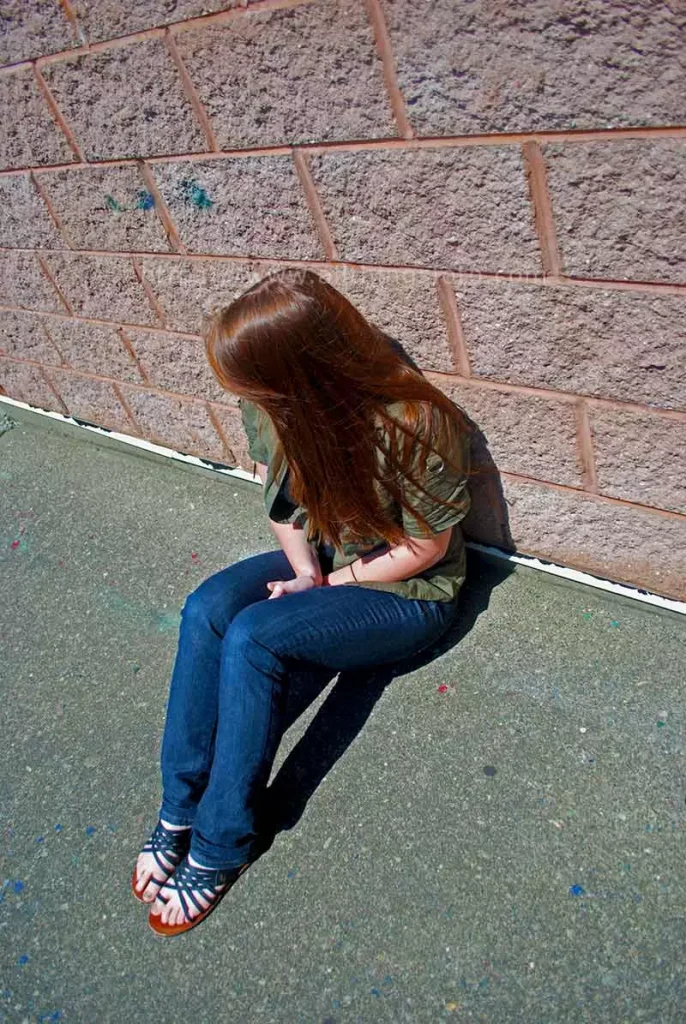
When taking portraits, negative space can be left in front of the subject’s gaze or in the direction they are facing. This not only adds depth to the image but also hints at the subject’s emotions and thoughts. If a person standing on a rock or cliff is centered in your image than you’re not using space appropriately. Try placing them in the left or right third of the frame to show space in front of them to lead your viewer to where they are looking or moving.

Action Photography
Capturing movement effectively is crucial in action photography. Enough space should be left in front of moving subjects, such as a runner or a moving car, to suggest where they are heading and to add a sense of motion.
This is known as active space and more active space is usually better for showing movement or direction when taking pictures.

Street Photography
Street photography shines with spontaneity and human moments. Utilizing the Rule of Space by anticipating where subjects will move or interact can create more engaging and thought-provoking images.

Tips for Mastering the Rule of Space
Understanding Negative Space
The space around subjects, called negative space, is crucial for the Rule of Space. It makes the subject stand out and highlights important details.
Learn the difference between dead space and negative space. Dead space in photography distracts viewers while negative space and active space naturally drag the viewer’s eye which enables viewers to follow the narrative.
Using Leading Lines
Natural or architectural lines called “leading lines”, lead the viewer’s eye towards the main subject. They strengthen the Rule of Space by directing flow and adding depth.

The Role of Backgrounds
Don’t ignore backgrounds, they help with the Rule of Space. A cluttered background distracts, while a well-chosen one adds depth and positive space.

Experimenting with Perspective
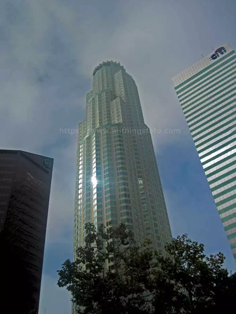
Changing your perspective can drastically alter the spatial dynamics of a photograph. Try shooting from different heights or angles to see how it changes the interpretation of negative space in your photography composition.
Common Mistakes to Avoid
Overcrowding the Frame
Adding too many elements to a frame can overwhelm the viewer and dilute the impact of the Rule of Space. It’s important to keep photography composition simple and focused.

Ignoring the Background
As I mentioned earlier, a messy or distracting background can undermine the spatial effects you are trying to create. Always consider how the background will interact with the subjects and the negative space around them.
Use a slow shutter speed to create a Bokeh effect. This technique creates intrigue when using macro.
Misjudging the Focal Point
The focal point should be clear and well-defined. Misjudging it can lead to a confusing composition where the Rule of Space does not effectively guide the viewer’s attention.
Advanced Techniques
Breaking the Rule for Creative Effect
Feel free to break the Rule of Space for creative effects, like any rule in photography. Sometimes, placing the subject close to the edge of the frame can create tension and intrigue, giving the photograph a unique edge.

Combining with Other Compositional Rules
The Rule of Space works well when combined with other compositional techniques like the Rule of Thirds, leading lines, rule of odds or framing. These combinations can create complex and layered photographic compositions.

Post-processing Tips
In post-processing, you can further emphasize the Rule of Space by adjusting the lighting, shadows, and contrast to highlight the spatial relationships within the frame.
Summarizing the Rule of Space in Photography
The Rule of Space is a vital technique in photography composition, enhancing movement, storytelling, and tension in images. It leverages negative space around subjects creating dynamic, engaging photos.
It enriches narratives by placing subjects within negative space, suggesting future actions or context. And it guides the viewer’s eye, creating directional movement, balancing photo elements by considering the weight of subjects and their surrounding space, resulting in aesthetically pleasing compositions.
In landscape photography, leave space in the direction of natural lines, like open sky before a mountain. In portraits, use negative space before the subject’s gaze or facing direction to add depth and hint at emotions. For action shots, active space in front of moving objects enhances the sense of motion, in street photography, anticipating movements creates engaging images.

To master the Rule of Space, understand negative space, use leading lines to direct your viewer, and choose complementary backgrounds to avoid distraction. Experiment with different perspectives to alter spatial dynamics.
Avoid common mistakes like overcrowding the frame, which overwhelms viewers, and ignoring the background, which can distract. Ensure a clear focal point to guide attention.
Advanced techniques include breaking the Rule of Space for creative effects, such as placing subjects near the frame’s edge to create tension. Combining it with other compositional rules, like the rule of thirds and leading lines, enhances the composition. Post-processing adjustments to lighting, shadows, and contrast further emphasizes spatial relationships within the frame.
Hopefully you’ve gained some valuable photography tips from me about using the Rule of Space in this article. Now you need to get out and start practicing by shooting moving objects, macro photography, portraits, landscape and other compositions.
As always, I encourage you to share my work, leave comments or ask questions if you still need some guidance. Thanks for reading!

